
Advice on how to create a high converting affiliate landing page usually comes as a list of tips with a percentage attached.
Those percentages come from other people’s pages, audiences and offers, so they say very little about yours.
A more useful approach is to treat every part of your page as a guess about your visitors. You change one part, watch what happens, and keep what works.
This is slow compared with copying a template, but it produces knowledge about your own readers that no template can.
This article walks through the five parts of a landing page worth testing (the promise, the proof, the offer, the button and the friction) and then covers how to test them when you only have a few hundred visitors.
That is a small sample, and you can still learn from it if you read the results carefully.
What a landing page is being asked to do for an affiliate visitor
A visitor arrives on your page because they clicked something: a link in an article, a search result, a line in an email.
They arrive with a question already in their head, and they will decide in a few seconds whether your page answers it.
Underneath, the page has to settle three questions in order:
- Is this about what I clicked for?
- Can I believe it?
- What do I do next, and what will it cost me?
Each of the five elements answers one of those questions.
The promise answers the first. Proof answers the second.
The offer and the button answer the third, and friction is whatever gets in the way of all of them.
Phrase each element as a hypothesis you can be wrong about: “If the headline repeats the words of the link that brought visitors here, more of them will click the button, because they will see right away that this is the page they wanted.”
That sentence has a change, an expected result and a reason, and the reason is what you learn from when the result comes in.
Keep the page to one job.
A page that tries to review a product, compare three alternatives and collect email addresses gives you three results mixed together, and you cannot tell which one moved.
Keep the habit of writing a hypothesis before each change. Drop the habit of editing a page because it “feels off” without saying what you expect to happen.
The promise above the fold: matching the click that brought them
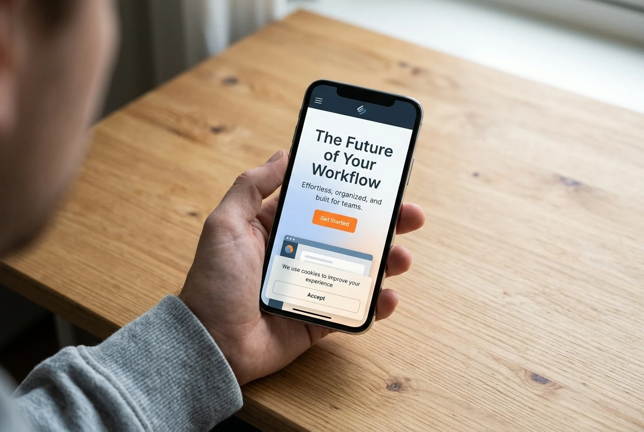
The part of the page visible without scrolling is the part every visitor sees, so it carries the promise.
On a phone that is a headline, a line or two of text and perhaps a button.
The most common problem is a mismatch with the click. Suppose a reader clicked a link that said “how to start a website for affiliate marketing” and landed on a page headed “Unlock Your Financial Freedom Today.”
The page may be about the same product, but the reader now has to work out whether it is the page they wanted.
Many will not bother.
A simple check takes ten minutes.
Write down the exact words of each link, search phrase or email line that sends visitors to the page.
Then read your headline and ask whether someone who just clicked those words would recognise them.
If the traffic comes from several different sources, the page may need a different headline for each. One page cannot repeat the words of five different clicks.
A good above-the-fold area usually contains:
- A headline that repeats the visitor’s own words
- One sentence saying who the page is for and what they get
- A button that is visible on a phone screen without scrolling
Open the page on your own phone before you decide it works. Desktop previews hide how much space the header, menu and any cookie notice take up.
Keep headlines that use the reader’s own language. Drop slogans that could sit on any page about any product.
Proof that a beginner can show honestly, without fake testimonials
Proof is the weakest area for most new affiliates, and it is where the temptation to invent things is strongest.
Made-up testimonials, inflated numbers and vague phrases like “thousands of happy members” damage trust, and in many places they break advertising rules.
You do not need them.
Honest proof is anything a visitor could check or see for themselves. These forms are available to a beginner:
- The product’s own published information, linked to its source. If you say what a platform includes, link to the page that says so.
- Screenshots of things you have actually done, such as the sign-up screens or a dashboard you really use. Show only what is true.
- Specific description in place of vague praise. “The sign-up has four screens and asks for an email address first” can be checked. “Super easy to join” cannot.
- Stated limits. Saying who the product is not right for makes the rest of the page more believable.
- Real reader questions, answered. If readers have emailed or commented with questions, answering them on the page is proof that you pay attention.
A clear affiliate disclosure also helps.
Visitors who see that you are upfront about earning a commission tend to trust the rest of the page more than visitors who have to find it in the footer.
The hypothesis to test is simple: replace one vague claim with one checkable claim and see whether more visitors click.
Keep any statement a reader could verify in under a minute.
Drop any statement you could not defend if the reader asked you to show the source.
Making the offer clear: what the visitor gets, what it costs, what happens next
A visitor who is interested but unsure what they are signing up for will usually leave rather than ask.
Your page should answer three questions in plain words before they have to wonder.
What do I get? Describe what the visitor receives on day one, not a list of every feature. Someone deciding whether to click wants to picture the first thing they will see.
What does it cost? If there is a price, say so, and link to the program’s own pricing page, because prices and free options change and you do not want a number on your page going out of date. If there is a free option, describe it exactly as the official page does.
Visitors who feel a cost was hidden from them rarely come back.
What happens next? Walk through the sign-up yourself in a private browser window, as a new visitor, and write down every screen.
Then describe those steps in order on your page: what the button leads to, what they will be asked for, and what they see afterwards. Visitors click more confidently when they know what the click leads to.
This is also a good place to check that your page is honest about earnings. If you mention income of any kind, base it on something you can show and say what it is based on. Otherwise leave income out.
The hypothesis here is that a visitor who knows the price and the next step is more willing to click. You can test it by adding one short paragraph that states the cost and the steps, and nothing else.
Keep a plain statement of cost and next steps near the button. Drop long feature lists that do not help a visitor decide whether to click.
One button, one action: cutting the friction between interest and click
Once a visitor is interested, everything on the page that is not the button is competing with it.
Menus, sidebar widgets, related-post lists, links to other offers and pop-ups all give the visitor somewhere else to go.
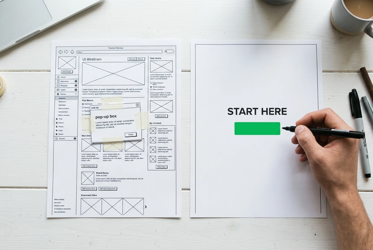
A landing page works best with one main action.
Repeat the same button, with the same destination, at the top, after the proof and at the bottom. Repeating one action is different from offering several.
Check these sources of friction first:
- Navigation. A full site menu on a landing page invites visitors to leave. Remove it or reduce it to a logo.
- Competing links. Each link to a different product or article splits attention.
- Vague button text. “Click here” says nothing. A label that names the action, such as “See how the sign-up works,” tells the visitor what to expect.
- Page speed on mobile data. Load the page on your phone away from your wifi. A page that takes a long time to appear loses visitors before they read anything.
- Pop-ups. One that covers the button on a phone is an obstacle.
If your current theme makes it hard to strip out a menu or sidebar, a dedicated page builder can help, and this comparison of AI landing page builders for affiliate pages looks at what each one actually changes.
The hypothesis is that fewer choices lead to more clicks on the one that matters. Test it by removing competing links from the page and leaving everything else alone.
Keep a single destination for every button. Drop every link that is not the page’s one job.
How to run a fair test when you only get a few hundred visitors
Small traffic changes how you test. The usual advice assumes thousands of visitors per version, and you do not have that, so you need a method that works with less.
Measure two things. Sign-ups are the result you care about, but at a few hundred visitors you may see only a handful. Count button clicks as well.
They happen more often, so they give you more to compare. Record sign-ups from your affiliate dashboard and clicks from your analytics, and check how your program reports referrals so you know how they are counted.
Change one thing at a time. If you rewrite the headline and the button on the same day and results improve, you will not know which change did it.
Make bigger changes. A hypothetical example shows why. Say 300 visitors see a page and 4 percent click, which is 12 clicks.
After a change, 6 percent click, which is 18. Six extra clicks looks like a 50 percent improvement, but a difference that small can easily happen by chance.
With little traffic, only large differences are worth trusting, so test changes that are large enough to matter, such as a different headline or a rewritten offer, and skip small tweaks like button colour.
Decide the run length first. Pick a fixed number of days or visitors before you start, and do not stop early because the numbers look good on day three.
Keep conditions similar. If you cannot split visitors randomly between two versions, run version A for a set period and version B for the same length of time, and check that the traffic sources were similar in both.
A burst of visitors from a different source can change results more than your edit did.
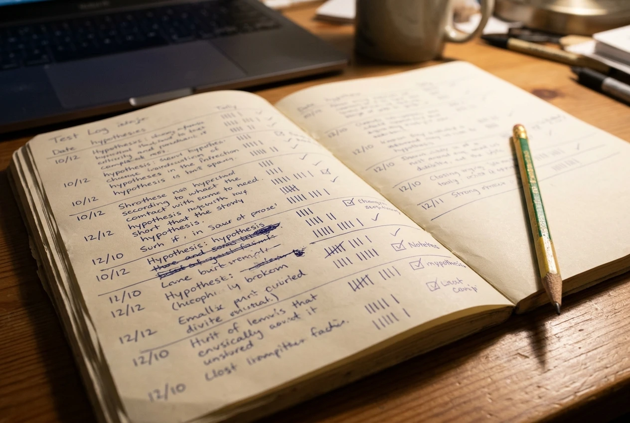
Keep a test log. For each test, write down the hypothesis, the change, the dates, the visitors, the clicks and the sign-ups.
After a few tests this log is the most useful thing you own, because it records what you have learned.
Keep tests with one change, a fixed length and a written hypothesis. Drop tests that change several things at once or end whenever you feel like it.
Reading your results without fooling yourself
With small numbers, the biggest risk is seeing a pattern that is only chance. A few habits protect you.

Check how much your page varies on its own. Before changing anything, compare two equal periods of the same page. If clicks differ noticeably between them with no change at all, that gap is your noise level. A test result has to beat it to mean anything.
Treat one result as a lead, not a conclusion. If a change wins once, run it again in a later period. A change that wins twice is worth keeping. A change that wins once and loses once is probably chance.
Look at counts, not only percentages. “Conversion doubled” sounds impressive until you see it went from one sign-up to two. Always write the raw numbers next to the percentage.
Watch for changes you did not make. A new article sending different visitors, a seasonal shift in interest or an email going out can all move your numbers. Note these in your log.
Accept flat results. If neither version wins, the change was probably too small to matter, or the element you changed is not what is holding visitors back. That is useful information, and your next test should target a different element.
If clicks are healthy but sign-ups are low, the problem may be after the click, on the sign-up page itself. This guide to finding and fixing the leaks in an affiliate funnel covers that stage.
Keep changes that win twice. Drop changes that only won once, and do not rebuild the page around a single result.
Your first three changes, in the order to make them
If you are not sure where to begin, this order starts with the changes that are cheapest and most likely to matter.
1. Match the headline to the click. Visitors who do not recognise what they clicked leave within seconds, before they see any proof or offer, so fix the promise first. It takes minutes, and the hypothesis is easy to state: using the visitor’s own words from the link will raise button clicks.
2. State the cost and the next steps. Walk through the sign-up yourself, then add a short, accurate paragraph near the button covering what the visitor gets, what it costs according to the official page, and what happens after they click. While you are there, replace any vague praise with one checkable detail.
3. Reduce the page to one action. Remove the menu, the sidebar and any links that lead away from the offer, and use the same button text and destination every time it appears.
Run each change as its own test, with a written hypothesis and a fixed length, and log the result before starting the next. Three clean tests will teach you more about your readers than any benchmark could.
If you want a place to build, publish and test a page like this, take a look at Wealthy Affiliate through my referral link and see whether it fits the way you want to work. It is a sensible next step for anyone ready to put this testing method into practice.
P/S – If you join Wealthy Affiliate through my link I may earn a small commission but without any extra cost to you